Within three weeks of winning the competitive pitch, we‘d launched a temporary website. Once the full branding was in place, we created how at800’s digital presence would look and feel. Six weeks later we launched the full site.

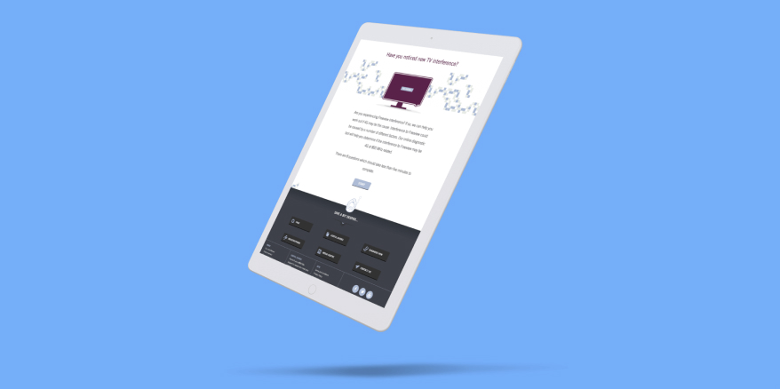
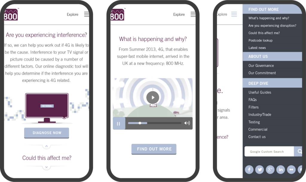
Accessibility is an essential design feature – the technical subject matter has the potential to be confusing, and it is likely users will include people who are not technically or digitally-minded. On a white background with an easy-to-read font, intuitive iconography and recognisable menus and buttons, the site is uncomplicated and reassuring. We’ve continued to make improvements to accessibility based on evidence from user testing.
Visitors can find out quickly what they need to know and do next. The video, which we commissioned, is an engaging and accessible way to inform users what support at800 can provide. Our diagnostic tool helps them work out if an interference problem might be caused by 4G.
Love the simplicity, clarity and ease of use. One of the best sites I’ve used, plus there is a vast amount of detailed info. Couldn’t be clearer if you tried
user feedback