Ready to explore the possibilities?
Request a quick call with our team to find out how the Innovation Explorer program can help your business take its next big leap into AI and automation.
The way people think, and how this affects your bottom line
User experience (UX) works rationally with theories of consumer psychology to optimise buyer journeys. Interesting, when you consider customers make purchasing decisions using ‘the emotional brain’.
We’re only human.
Most of us like to believe we’re in complete control of the decisions we make. We’re not. As sophisticated as our 21st century selves are, we’re only human. And human behaviours are influenced by evolution across millions of years.
We share the same motivations as our ancestors. The human brain that stocked up on loo roll in 2020 is also the one that stored dried mammoth meat at the back of a cave dwelling to get through the winter. It has a fast mode and a slow mode. It behaves instinctively and is rarely rational.
In marketing, if we can truly empathise with the human brain’s dual operating system, we can identify what customers want/need and how best we can provide this. In performance marketing, key to the discovery and implementation of these are user experience (UX) and Conversion Rate Optimisation (CRO).
How to identify & give customers what they need
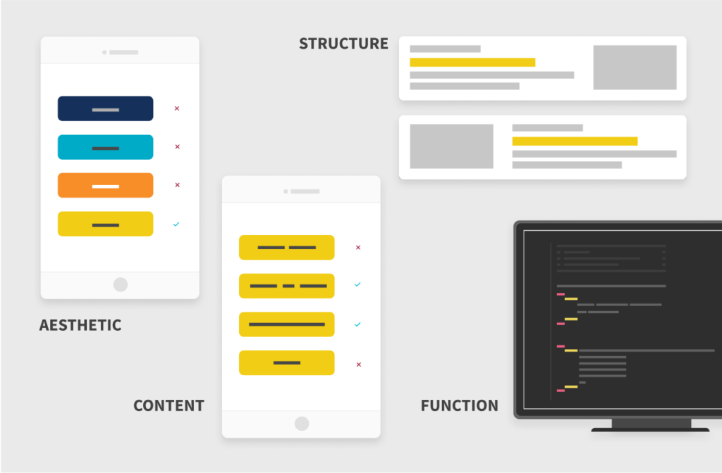
Aesthetic, content, structure & function – the pillars of UX. Each can be tested and continually optimised for conversion.
As a practice, UX is the design of a website that enhances the buyer journey. It incorporates many elements but we can distill it down to four key areas: aesthetic, content, structure and functionality conventions to create the right conditions for customers to make decisions. In other words, in e-commerce, good UX leads to sales, profit and growth.
UX testing makes sure you get these elements right – that they meet the needs of your customers. Testing measures the impact of variants (like button colour or headlines) and the data shows which changes will improve conversions.
TEST → MEASURE → ANALYSE → CHANGE → TEST
These changes are the iterative process known as CRO. Anything based on what’s “cool” or “done by a competitor” might be wrong. This is, ironically, down to our psychology! Customers and marketers alike – we believe we’re rational thinkers and love to use our subjective experience to make snap judgements. A truly rational mind would seek out the data, wouldn’t it?
A brief history of human psychology
We make around 35,000 decisions daily – from the mundane (what to have for breakfast) to the more complex ( a high value purchase). All this goes on in the privacy of our brains. Except, it’s not so private – or unique. As humans, we’re pre-programmed to behave in certain ways in particular situations.
The Ancient Greek philosophers knew – we’re still talking about their theories 2,000 years later. Modern psychology has been providing scientific insight since the 19th century. In the mid-20th, Abraham Maslow set out ‘A Theory of Human Motivation’ (1943), which argued that we humans are motivated by five essential needs:
- Psychological
- Safety
- Social
- Self-esteem
- Self-actualisation
And in our digital age, Nobel prize-winner Daniel Kahneman finally gave us a theory that nailed down how and why customers make purchasing decisions. His book ‘Thinking, Fast and Slow’ (2011) identified the human brain’s two different modes of thought, System 1 and System 2.
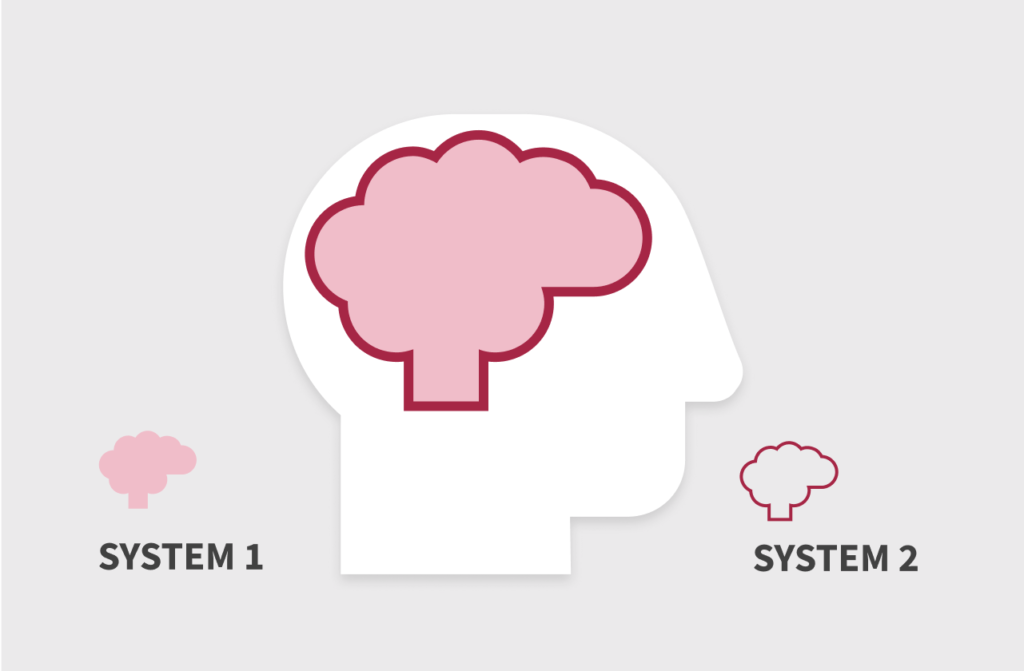
Daniel Kahneman’s theory of System 1 (98%) vs System 2 (2%) modes of thinking.
These operating systems are polar opposites and they’re in control of your credit card, your car, your relationships, and every other aspect of your life.
If you’re still hoping the mode that makes 98% of your decisions is the rational one, take a deep, calming breath now.
Our fast & slow human brains
If the conditions are right, our brain is more than happy to make snap judgements based on heuristics – mental shortcuts that help us make decisions quickly. This is System 1 thinking (and aligns with Maslow’s theory of motivations). The right conditions include the product being popular with other people, and being able to go through checkout quickly and without fuss.
We all love System 1 thinking! Job done – tick! What next?
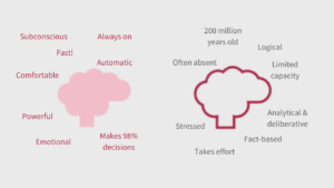
System 1 thinking vs System 2 thinking.
On the other hand, our poor System 2 mode only gets a wake-up call when customers have to make decisions that are more complex.
But it doesn’t have to be this way. As marketers harnessing UX, it’s in our power to create as much of a System 1 experience as possible – even for purchases that require slower, effortful thinking. This is the way to customer satisfaction, growth and profit.
UX – creating a System 1 experience
In e-commerce, we want customers to feel reassured enough to:
- Make FAST system 1 decisions
- Feel complex decisions feel more like a System 1 experience
- Have everything they need to feel good about making SLOW system 2 decisions.
It’s the responsibility of the aesthetic, content, structure and functionality (the UX) of your website to create the right conditions for your customers to make the decisions they need to make.
Aesthetic, content, structure & function
- Easy-to-complete web forms
- Appropriate tone of voice
- Appropriate imagery
- Clear information and instructions
- Identifiable focus of attention
- Prominent calls to action
- Structured, intuitive menus
- Answers key questions quickly
- Recognisable trust credentials
- Simple, intuitive layouts
- Efficient checkout experience
Ethics & consumer psychology
Utilising consumer psychology is a powerful tactic that can change the actual chemistry of the human brain. The aesthetic, content, structure and functionality of your website has the power to make a consumer – a person – feel stressed, fearful, relieved, happy or anything in between.
While ‘loss aversion’, ‘urgency’ and ‘scarcity’ are legitimate motivations, we want people to feel good, whatever they’re buying and whichever mode they’re in. Considerate and carefully considered UX testing makes sure we can stay away from negative practices and establish your brand as one that looks after its customers.
Ready for more?
This is one in a series of articles about UX and consumer psychology – browse the other titles on the main page or head over to discover more about conversion optimisation.
Get started
The way your customers think affects your bottom line. You can avoid wasting time, money and effort on things that don’t work by using UX testing. This will tell you what your customers want/need from your website. Let’s talk it over – book a situational analysis to:
- BENCHMARK where you are
- EVALUATE what is required to achieve your commercial goals
- Outline the PLAN of action to get you on track.
-
 14.12.2021|Your customers want information fast. If the design of your website is confusing, they’ll go somewhere else. Creating instant clarity supports the human preference for instinctive decision-making and makes the sale.
 -
 14.12.2021|The human brain is impulsive and favours speedy decisions, but it’s also highly emotional and loves a good story. Identifying the right words means tapping into the driving motivations at each point in their journey.
 -
 14.12.2021|Structure and hierarchy drive the buyer journey from awareness to conversion. The human brain wants a fast experience, or one that feels fast. If the look and feel of your website is getting in their way, they’ll bounce somewhere else to spend their money.
Door4 opinions and insight.
We have a lot to talk about.Our latest articles, features and ramblings.
We explore performance marketing, AI, communications and optimisation.
