The human brain is impulsive and favours speedy decisions, but it’s also highly emotional and loves a good story. Identifying the right words means tapping into the driving motivations at each point in their journey.
A test is born.
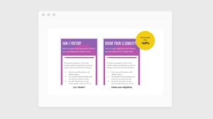
Once upon a time, a copywriter who was drafting a landing page couldn’t decide between two very persuasive variants. She knew her client’s proposition, tone of voice, and customer demographic well. However, she couldn’t decide which wording would encourage customers to respond positively; she wasn’t sure what they needed. Was it the strong and motivational approach? Or was it the softer, more empathetic?
She raised it with the Conversion Rate Optimisation (CRO) Manager and a UX copy test was born. The landing page went live with two test variants. The eventual winner boosted total site conversions by 14%.

Testing copy – ‘What will our users respond to?’ shouldn’t be a guessing game or trial-and-error.
The role of your copy
Copy tells the story of why customers should care, in a way that speaks to their motivations and beliefs.
Copy articulates why the customer is here on this page and what they need to do next. More importantly, copy tells the story of why they should care, in a way that speaks to their motivations and beliefs. The aesthetic, structure and functionality of the page are designed to support this story.
If you can create a compelling narrative on a page and across your website – from the hero headline, to the product description, and to the micro copy in form fields in a shopping cart – you’re onto a winner.
Why humans like stories
We’re neurologically wired to engage with stories, in the telling and the listening.
- They help us understand (if they are easy to follow)
- They help us remember what happened (a beginning, middle and end)
- They end with a release of oxytocin, a feel-good hormone
In ‘The way people think, and how this affects your bottom line’, we looked at Daniel Kahneman’s theory of ‘Thinking, Fast and Slow’. Kahneman identified that the human brain makes decisions using one of two very different modes or operating systems.
- System 1 is FAST, emotional, impulsive and accounts for 98% of our decisions.
- System 2 is SLOW, rational, analytical and under stress to make a good decision.
Stories are rooted in System 1 – yes, often they are an emotional journey, But another key characteristics of our ‘little brain’ mode of thinking is that it likes to use its past experiences to make snap judgements. Stories have recognisable structures that facilitate this mode of thinking by encouraging this kind of heuristic shortcut.
And this mode of thinking is what, as marketers, we want to encourage. We need to craft our copy purposefully and with intent, encouraging System 1 decision-making even for complex purchases. In short, we need to make the purchasing process comfortable, fun, easy, reassuring and prompt.
What is good copy?
There’s a lame joke in marketing circles that goes along the lines of “nobody reads the copy anyway”. This isn’t true – they’ll read it if it’s a good story, or if it’s simply, just, good.
Seen through the lens of e-commerce, good copy makes sales. It tells stories, reassures, educates, informs, persuades, prompts. It sells. It can be lengthy or brief (or even micro), formal or conversational, persuasive or funny or scary or reassuring or … Whatever its form and tone, good copy meets customers’ needs.
Let’s aim higher. Great copy elicits the most conversions of any other wording. It sends sales and average order values higher than they’ve ever been. How can we find greatness in our copy? We test variants.
Great copy elicits the most conversions. How can we find greatness in our copy? We test variants.
How to write and optimise copy
As with any testing (aesthetic, structural or functional), personal experience will give you a fair starting point. However, while anecdotal evidence has its place, the real juice is in the data. Research gives you good ground to start testing and optimising.
Writing your copy
1. Know your demographic.
- Do keyword research
- Look at your PPC data
- Comb through the visitor data in Google Analytics
- Read the reviews and customer satisfaction surveys
- If you can, ask your customers directly
2. Know your competition
- What are they doing better?
- Are they making more money than you?
- What keywords are they using?
- What tone of voice are they employing?
3. Know what you’re selling
- Brand (values, mission, tone of voice, style)
- Product (features, benefits, USPs)
4. Know the brief
It is a truth universally acknowledged that a copywriter in possession of a brief will be in need of a better one.
Your copywriter shouldn’t have to rely upon psychic powers, luck or osmosis to get what they need. They’ll have questions so they have the context they need to do the best job they can.
- Objective (what do we want them to do)
- Buyer journey (where have they come from, how will they complete the conversion)
- Wireframe (what does the UX designer have in mind?)
- Pain points (to ascertain potential persuasion techniques)
Optimising your copy
In many cases, copy goes live and other variants are tested against it. Sometimes, testing discovers that the original is converting customers optimally; sometimes not.
It’s completely legitimate for your copywriter to put the work in and craft a good first iteration. But this is where the data needs to take over, with science-based testing that proves the sales-worthiness of different variants.
UX testing will transform good copy into messaging that speaks to the needs of each customer. Testing collects meaningful data; analysis of this data points to the changes needed to facilitate an upswing in conversions.
What can be tested?
- Formatting
- Headlines & sub-headings
- Button / CTA copy
- Tone of voice
- Length
- Persuasion techniques
1. Formatting
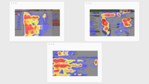
Your web pages should be easy to read and easy to skim. Customers read from left to right and skim pages in an ‘F pattern’, taking meaning quickly from headlines, sub-headings and lists (plus images).
This is System 1 thinking – and we want to encourage it. Our messaging and the call to action must be clear. But also, more complex information must be readily available for customers who have a System 2 need.
People read from left to right and skim pages in an ‘F pattern’, taking meaning quickly from headlines, sub-headings and lists.
We talked about the look and feel of text in more detail in ‘The influence of your website aesthetic on customer behaviour’, but to recap: formatting and layout make your landing page readable, clear and easily digestible. On the aesthetic side:
- Font size, line height, and the colour of the text
- A readable font – nothing too fancy or too light
- Use lists, pull quotes, short paragraphs of 3-4 lines
- Adequate white space with less ‘noise’
2. Headlines & sub-headings
Skimming a page in an ‘F pattern’ gives readers a feel for the information, allowing them to decide whether they want to read the page in its entirety. It’s a System 1 habit that we want to encourage by making the most of the standout elements like headlines and sub-headings.
- This starts at the top, with a strong headline that defines the single reason for the page
- Sub-headings break the story down into manageable chunks visually and topically
- Sub-headings can also be used to summarise the story point by point (‘F pattern’)
- Sub-headings are a persuasive glimpse into an interesting story
- Sub-headings give a longer form piece some hierarchy and structure
- Sub-headings are important for technical SEO in the form of title tags (H2, H3 etc)
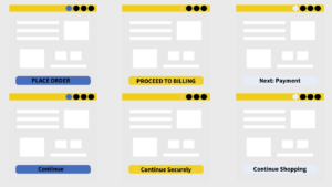
3. Button/CTA copy
The copy that prompts the customer to take action must be clear and compelling. Call to actions (CTAs) are a fertile testing ground and often the results are surprising.
It’s common to make assumptions about the optimal language that will make a conversion, especially if, as a marketer, you’re not of that demographic. Of course, you can probably make a good guess – which should be tested against variants to find the one that prompts the most sales.
- CTAs can’t be shy, vague or off-tone
- Customers should understand immediately what they need to do
- CTAs can appear multiple times on the page – including above the fold
Small UX copy changes can alter everything.
4. Tone of voice
Your brand will have an established tone of voice. When it comes to e-commerce and UX testing, it’s beneficial to keep an open mind. As mentioned above, we make assumptions about the language that will prompt our demographic to take a desired action. The only way to find the best words that will optimise conversions is to test.
Testing tone of voice is often as simple as using different words to say the same thing. Even though sectors differ in tone generally, there’s still a lot of flexibility and creativity to be explored through tone of voice testing.
- Formal vs informal
- Long words vs short words
- Jargon vs Plain English
- Upbeat vs decisive
- Excitable vs calm
- Businesslike vs leisurely
- Urgent vs reassuring
- Intimate vs global
The great thing about UX testing on tone of voice is that it has the potential to inform you on optimisations that are so far-reaching you decide to tweak your brand style to align it with what your customers want.
5. Length
Our goal is to transform every purchase decision in the buyer journey into a System 1 decision, or as near as dammit. So, we need short form and long form copy to cater to both System 1 and System 2 thinking.
The human brain’s System 1 mode of thinking is FAST. This is why:
- Bullet points are an excellent tactic
- Headline quality is critical
- The whole story can be summarised through sub-headings
- Snappy, concise, precise copy meets practical requirements
- Tight choice of words and metaphors meets emotional requirements
- Personality is important
Slow System 2 thinking shouldn’t be encouraged, but sometimes it has to be accommodated. The emphasis is on making this as painless, effortless, fun and satisfying a purchase as possible.
- Logical, detailed
- Often it’s a narrative
- Occasionally it’s funny and sad and clever
- It’s still got personality
UX aside, it’s worth bearing in mind that the minimum recommended word length for good SEO on a web page is 300 words.
If you’ve got this far down this particular page, you’ve read or skimmed 1,600 words and counting. Good going.
6. Persuasion techniques
Our copy needs to be sympathetic to the FAST brain (the one that happily makes 98% of our decision), so there’s a requirement to understand the many different, easy paths. Persuasion techniques are used across aesthetic, structure and functionality too. In copy, tactics might include:
- Testing a short list of USPs against longer lists or long copy
- Framing headlines as questions to invite a sense of working it out for themselves
- Use scarcity, exclusivity, urgency, fear, indispensability, guarantees
- Test unusual, quirky, emotionally charged copy elements
- Be repetitive about features and benefits, use consistent phrases
- Test front-loading copy techniques that go straight to the solution
How we test copy elements
At the start, we can make general assumptions about what will work, using our experience. However, assumption should only ever be a testing ground! Data we collect on the behaviours of your audience will tell us quickly enough what elements are encouraging sales.
1. Usability Research
We use UX testing to identify – with solid data – what customers want/need and respond to. Changes made based on what “looks good” or “reads well” are subjective and usually wrong.
2. A/B Testing
Making the required changes that have been proven to work. These changes are known as Conversion Rate Optimisation (CRO).
Ready for more?
This is one in a series of articles about UX and consumer psychology – browse the other titles on the main page or head over to discover more about conversion optimisation.
Get started
The way your customers think affects your bottom line. You can avoid wasting time, money and effort on things that don’t work by using UX testing. This will tell you what your customers want/need from your website. Let’s talk it over – book a situational analysis to:
- BENCHMARK where you are
- EVALUATE what is required to achieve your commercial goals
- Outline the PLAN of action to get you on track.