
27.07.2021|
UX research uses data and anecdotal evidence to improve page design for users. Boost your conversions, remove obstacles and streamline sales journeys.

Hold on! this is part two – if you’ve come from part one, excellent, do carry on. Still, if you’ve landed here without reading part 1 first, you’re missing out on a cracking introduction to OOUX frameworks and the secret to impactful design elements. Read part one here.
 To get a good hypothesis it’s worth putting the time in. How do our competitors do it? Are there other examples in different industries that have a process that we could relate to? What does the data say?
Conversion optimisation isn’t a one-and-done process – it’s a cycle of continuous improvement. Think of it as a feedback loop where each round of changes informs the next. We start with research to understand user behaviour, make informed design changes to improve conversion, then dive back into research to measure our impact and uncover new opportunities.
This iterative approach is what separates successful websites from those that stagnate. Every test, whether it succeeds or fails, teaches us something valuable about our users. Maybe that shiny new call-to-action button actually decreased conversions – that’s not a failure, it’s valuable data that helps us understand our users better.
The key is to embrace this cycle. When we see positive results, we investigate why they worked and look for other areas to apply these insights. When changes don’t perform as expected, we analyse the data to understand what our users are really looking for. Each iteration brings us closer to a website that truly serves our users’ needs – and better-served users mean better conversion rates.
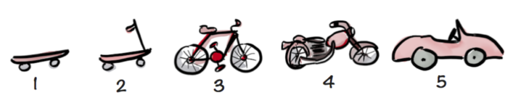
This classic UX image perfectly illustrates not just MVP development, but also the evolution of conversion-focused design. While all these forms of transport will get you from A to B (just like any “Add to Basket button will technically let users make a purchase), who wouldn’t choose the sleek convertible over the basic skateboard?
The same principle applies to your website’s conversion elements. Sure, a plain text link might do the job, but a well-designed button with clear hierarchy, thoughtful placement, and compelling copy creates a more engaging, trustworthy, and effective user experience. Each iteration builds on what we learn from user behaviour, moving us from that basic skateboard toward the convertible – a solution that not only works but delights our users.
But here’s the key difference from MVP development: in conversion optimisation, we don’t have to wait until we’ve built the convertible. We can test each improvement incrementally, measuring its impact on user behaviour and conversion rates at every step.
While A/B testing gives us hard numbers on what works better, qualitative UX research helps us understand the why behind those numbers. Data might tell us that users are abandoning a form, but only through user interviews and session recordings can we discover that they’re getting stuck on a confusing question or frustrated by a technical glitch. By combining quantitative data (conversion rates, bounce rates, heat maps) with qualitative insights (user feedback, usability testing, behavioural observations), we build a complete picture of the user experience. This dual approach ensures we’re not just chasing numbers but truly understanding and solving user problems.
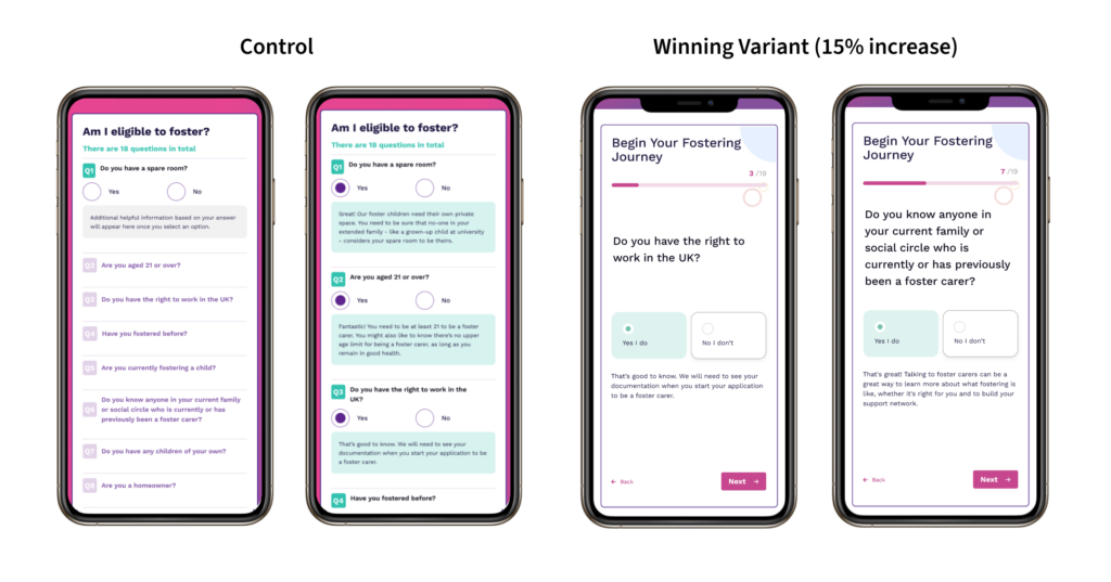
Problem –
A lengthy onboarding questionnaire with over 20 input fields was overwhelming potential foster carers, causing them to abandon the process early and resulting in lost leads.
Hypothesis –
By changing the form to a multi-step process, we expect to see an increase in conversion rate as a result of encouraging System 1.
Solution –
We simplified the UI by presenting one decision at a time. Each screen shows users their progress through the questionnaire and provides context about what we’re asking and why it matters.
Results – Primary goal: CIF (form completion) conversion rate
15% improvement in conversion rate
The multi-step form engaged System 1 thinking, leading to faster and more intuitive responses from users.
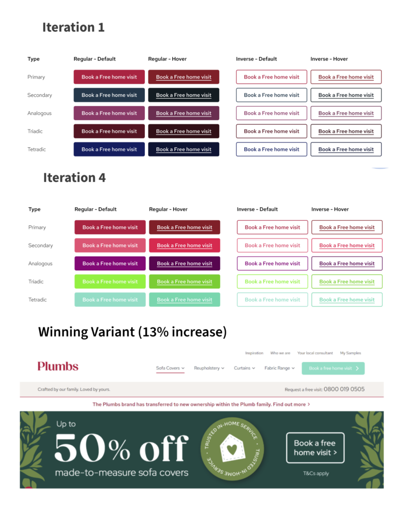
Problem –
Lack of visual distinction between the primary CTA reduces its effectiveness in capturing user attention and driving conversions.
Hypothesis –
By increasing visibility and prominence of the visit request CTA, through a high contrast colour, we expect to see an increase in conversion rate
Solution –
Through a structured A/B testing approach, we conducted four iterations of CTA colour testing. Each iteration tested different colour combinations based on established colour theory – including complementary, analogous, triadic, and tetradic schemes – against the control version. Tests ran for approximately two weeks each with over 5,000 visitors per variant.
Results –
The results showed varying effectiveness across iterations, with analogous colours initially performing best (15% improvement), followed by a successful tetradic scheme (12.5% improvement). After a period where the control maintained dominance, the final iteration’s tetradic colour scheme achieved a 13% conversion rate improvement with 82% probability to beat baseline, leading to its implementation as the primary CTA design.
Successful conversion optimisation isn’t about quick fixes or following trendy design patterns – it’s about understanding your users and methodically improving their experience. Through the strategic use of visual hierarchy, thoughtful CTAs, and authentic social proof, backed by both quantitative testing and qualitative research, we can create user journeys that feel less like a wobbly skateboard ride and more like cruising in a luxury convertible.
The OOUX framework gives us the structure to organise these elements effectively, while our iterative research-test-learn approach ensures we’re constantly moving toward better solutions. Remember: every failed test and successful improvement adds to our understanding of what users really need.
In the end, the most effective conversion optimisation strategy is one that puts users first. When we focus on making their journey smoother, more intuitive, and more trustworthy, the conversions naturally follow.
Author: Darren Taylor, UX Lead, Door4


Our latest articles, features and ramblings.
We explore performance marketing, AI, communications and optimisation.