Have you ever rage-quit a website because you couldn’t figure out how to do what you went there to do? We’ve all been there – struggling to find the information you came for, losing the will to live while completing an overly complex form, or giving up on a purchase because the checkout process feels like they don’t actually want your money.
 As a site owner, watching potential customers abandon their shopping baskets or bounce away to competitors can be frustrating. And while competitive pricing can account for some of this abandonment, it’s often not the real culprit. The truth? Your website’s design could be secretly sabotaging your success.
Before we dive into solutions, we need to understand what makes users tick – and what makes them click away. What elements of your design are creating friction instead of facilitating conversion?
So how do we figure out what’s actually working (or not working) on our site? There are two main approaches we can take: Just Do It (JDI) changes and more systematic A/B testing.
Let’s start with JDI. Sometimes, when a design issue is glaringly obvious – like a tiny, grey “Buy Now” button that blends into the background – we don’t need extensive testing. We can just fix it. These are what we call JDI changes: straightforward improvements based on well-established design principles and common sense.
But what about those trickier situations where we’re not quite sure which design change will work best? That’s where A/B testing comes in. Think of it as a scientific experiment for your website. You create two (or more) versions of a page, show them to different visitors, and let the data tell you which version performs better.
For example, you might test:
- Version A: Current “Add to Basket” button in brand green, positioned below the product description
- Version B: “Add to Basket” button in brand orange, positioned below the product description
- Version C: Same button moved above the product description, making it immediately visible without scrolling
- Version D: Button in the same higher position, but text changed to “Add to Basket – Free Delivery” to highlight an existing benefit
The beauty of multi-variant testing is that it takes the guesswork out of design decisions. Instead of relying on opinions or hunches, you get clear data showing which version actually convinces more visitors to become customers.
A framework for success
At Door4, we leverage the Object-Oriented User Experience (OOUX) framework to understand and structure digital domains. This approach identifies key elements as Objects (nouns or things) and analyses them through the ORCA lens: Objects, Relationships, Calls to Action, and Attributes.
By breaking down each Object, we gain deep insights into their purpose, connections with other Objects (Relationships), core information (Attributes), and how they facilitate user tasks through CTAs. While we can explore the technical details another time, this framework has proven invaluable in uncovering hidden opportunities and potential pitfalls early in our projects.
Once we have all the information mapped out we can optimise the user flow by removing or deprioritising elements and in doing so we prioritise and promote the content that matters, and more importantly, what converts.
OOUX in action
Moving on…
Now that we understand how to test and measure changes, let’s explore some key design elements that most often impact conversion rates. These are the building blocks that, when thoughtfully implemented and tested, can transform your user experience from functional to exceptional.
Does your site have Impactful design elements?
Clear call-to-action buttons
Call-to-action buttons are our secret weapon in guiding users towards conversion and a key part of our thinking. These digital signposts tell visitors exactly what to do next, but they need to work hard to be effective. When buttons blend into the background or use vague language like “Sign Up” or “Learn More,” you’re essentially hiding the path forward from your users.
The best CTAs stand out visually through strategic use of colour, size, and white space, while using action-oriented language that creates urgency and communicates value. We can go beyond basic commands to create compelling CTAs that speak directly to user needs: “Get Your Free Marketing Guide,” “Start Your 30-Day Trial,” or “Reserve Your Spot.” Even better, we can add social proof to drive engagement – “Join 500+ Marketing Pros” is far more compelling than a simple “Sign Up.”
When done right, CTAs remove all guesswork from the user’s journey, making it crystal clear what exciting next step awaits them.
Visual hierarchy and White Space
Ever notice how your eyes naturally follow a specific path when reading or viewing content?
That’s a visual hierarchy in action, and it’s far from random. Look at this simple example:
Large, bold text commands your attention first. Then, as if following a carefully laid trail, your eyes move to the next line, and finally to the smallest text. This isn’t by accident – it’s design psychology at work.
Visual hierarchy, combined with strategic use of white space, guides users through your content like an invisible tour guide. White space isn’t just empty space – it’s breathing room for your content, helping important elements stand out and making information easier to digest. Think of it as the pauses in a conversation; without them, everything would blur together into noise.
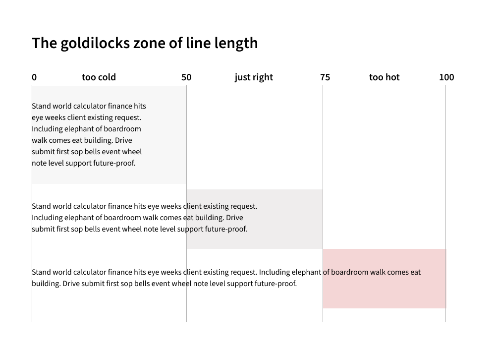
Another consideration is readability, a crucial principle is the 50-75 character rule. Think of it as the Goldilocks zone for line length – each line of your body text should contain between 50-75 characters (including spaces). Why? Because our brains get tired when lines are too long, and too short makes reading feel choppy.
When your text is easy to read, visitors are more likely to engage with your content and follow it through to your call-to-action. It’s a small detail that makes a big difference in keeping users engaged with your message.
Social Proof
As mentioned above with our “Join 500+ Marketing Pros” CTA example, social proof is a powerful tool for building trust and confidence with your users, especially when your brand is competing with better-known competitors. But there’s much more to social proof than just numbers.
Trustpilot has become the gold standard for e-commerce credibility, with its familiar star rating system appearing prominently on many successful websites. These third-party verified reviews carry more weight than traditional testimonials because users know they can’t be edited or cherry-picked. Displaying your Trustpilot rating, especially if it’s above 4 stars, can significantly impact conversion rates.
But effective social proof goes beyond just star ratings. Consider these powerful trust signals:
- Customer reviews that highlight specific benefits or overcome common objections
- Industry awards and certifications displayed at key decision points
- “As featured in” media mentions from recognised publications
- User-generated content showing your product or service in action
The key is authenticity. Modern users are savvy – they can spot fake reviews and manufactured social proof from a mile away. We see more and more obvious AI-generated reviews. You often see the tell, the content directly repeats the original quote. Usually on feedback supposedly from the site owner, like in the example below.
********
“The lady who completed my treatment was amazing. Skye is amazing at her job and I was made to feel fantastic after my treatments.”
——-
Dear ••••••,
Thank you for sharing your feedback with such sincerity. It’s wonderful to hear that Skye provided an exceptional treatment experience and made you feel fantastic. She truly sounds like a valuable asset to the team.
********
…🤔 Hmmm, she truly does.
Focus on gathering and displaying genuine feedback and achievements that resonate with your target audience’s needs and concerns.
___________________
Understanding what makes users tick—and what makes them abandon ship—is the foundation of effective conversion optimisation. By leveraging frameworks like OOUX, testing design changes systematically, and using research to guide decisions, we can create experiences that remove friction and encourage action. But the work doesn’t stop here.
In part two, we’ll dive deeper into the elements that truly impact conversion, from compelling CTAs to the psychology of visual hierarchy. We’ll also explore how an ongoing cycle of research and iteration ensures your site stays optimised for success.
Author: Darren Taylor, UX Lead, Door4


 As a site owner, watching potential customers abandon their shopping baskets or bounce away to competitors can be frustrating. And while competitive pricing can account for some of this abandonment, it’s often not the real culprit. The truth? Your website’s design could be secretly sabotaging your success.