Structure and hierarchy drive the buyer journey from awareness to conversion. The human brain wants a fast experience, or one that feels fast. If the look and feel of your website is getting in their way, potential customers will bounce somewhere else to spend their money.
Information is like porridge.
When we’re giving customers the information they need to make a decision, the journey through this information is everything, Or, put another way, the buyer journey needs particular information at every stage. Too much and it’s confusing; too little and it’s frustrating. Like Goldilocks, in her classic porridge UX test, we need it to be just right.
Aesthetic, copy, structure & hierarchy, and function work together to impart the right information at the right time. It’s the job of structure and hierarchy to present the information in a logical, intuitive and meaningful way. It applies to the sales, funnel, the website, and the page.
- Sales funnel
- User journeys
- Navigation/menu
- Breadcrumbs
- Above the fold
- Below the fold
It’s unlikely that you can design a structure and hierarchy that will satisfy every single buyer journey. However, with iterative UX testing, you can refine and refine until you have the optimal structure and hierarchy possible.
The holy grail of user journeys
It’s an area that the government gets right, owing to their design principles. Think about the passport application process, or tax return process – users are asked for 1-3 pieces of information per page.
This flies in the face of the early noughties trend of reducing the number of clicks a visitor makes. Actually, we know now that users love clicking because it gives them a reassuring feeling of progression! Providing a strong structure allows this.
Thinking, fast and slow
The structure of GOV.UK demonstrates very well how potentially complex user (or buyer) journeys can be simplified. When we look at how the human brain prefers to operate, it’s a lightbulb moment for e-commerce.
In The way people think, we talked about how Daniel Kahneman’s theory of the two thinking modes of the human brain can be used to optimise the buyer experience.
- System 1 is FAST, instinctive, impulsive and accounts for 98% of our decisions.
- System 2 is SLOW, rational, analytical and under stress to make a good decision.
As marketers harnessing UX, we have the power to create as much of a System 1 experience as possible – even for purchases that require slower, effortful thinking.
Structure and hierarchy as the user journey
Holistically, we can consider structure and hierarchy on three levels:
- Funnel
- Website
- Page
1. Sales funnel
Your funnel – your buyer journey – often starts off-site in a variety of different places, including Facebook Ads, Google Ads, organic search results, your newsletters, email nurturing campaigns, events, and word of mouth.
The sales funnel is a vast topic and we won’t be covering it in any depth here. However, it’s a key point in your understanding of structure and hierarchy. You need to know:
- Where the customer enters the funnel (and what they are expecting to find)
- What information/support they need to make a conversion
- How your website is going to provide the information/support (optimally)

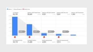
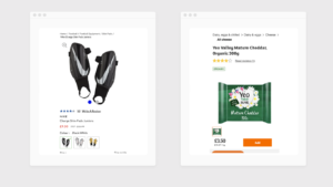
UX testing different shopping cart variants and their impacts on abandoned carts.
Website
User journeys
Every page on your website has a goal. How do we create a buyer journey that is clear and gives them everything they need to progress at each stage?
As we mentioned above, your customers:
- Will enter your website at different points
- Arrive from different places – paid and organic
- Be in different phases of the buyer’s journey
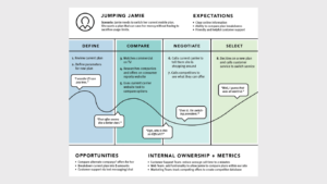
Journey mapping is a visual representation of how your customers progress through your website, from entry to conversion and exit. Each stage(or page) should convince them to proceed.
Lauded copywriter Eugene Schwartz identified five states of awareness that are critical to how we design user journeys. The purpose of a user journey is to allow customers to find what they need /want as quickly as possible and make the conversion.
The 5 customer awareness levels
- Unaware – Don’t know there’s a problem or that your brand offers a solution
- Problem aware – Know they have a problem but don’t know there’s a solution
- Solution aware – Know there’s a solution but don’t know your brand’s solution
- Product aware – Know your product but don’t know if it is right for them
- Most aware – Know your product or brand and know it’s their choice
Schwartz’s awareness levels draw our attention to a requirement for the website to serve different information at different points in the user journey. It would be impossible to do this for every customer, so we have to test what works for the majority.
Kahneman’s theory works well alongside awareness levels – it makes sense to give customers what they need at each particular stage of their buyer journey to elicit a System 1 conversion and transform a System 2 experience into its faster, more emotionally satisfying sibling.
The complexity of the buyer journey. Can we make it as simple as possible?
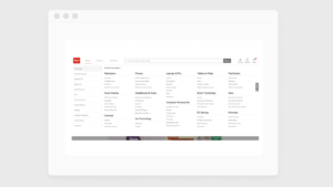
Navigational categories/menu
E-commerce sites vary in their complexity due to the broad or narrow range of types of products available. However, whether you’re a behemoth like John Lewis or a niche retailer like PaintNuts, a good structure is the backbone of your website.
Your menu is a logical visualisation of your navigation, though you can choose how many layers you visualise. Its depth will be guided by the complexity of your product range as well as what works best for your customers – and you can test whether a smaller menu or a mega menu works best for the user journey.
There’s a clear visual hierarchy between parent and child categories in the navigation. This makes it easier for users to understand the structure of your site.
Depth
Working with structure and navigation brings up the issue of ‘how many levels should my website have?’.
- From a UX perspective, an e-commerce website shouldn’t send customers many layers deep. We want to meet the requirements for FAST System 1 thinking and not complicate a buyer journey.
- From an SEO perspective, the depth of a site can denote expertise and authority, two thirds of Google’s E-A-T philosophy (the third is trust). There are areas of the site where depth can be used appropriately, in ways that won’t impact System 1 thinking; like in an ‘about us’ section.
Breadcrumbs
These are best practice rather than a mandatory element, but the more complex your website, the more you need them. They work well in conjunction with other navigational elements, like menus and ‘customers also bought’. If you don’t use breadcrumbs, you might have to up the ante on the other elements around the site as a whole.
Their job is to clearly signpost where a customer is and allow them to easily click to another element within the hierarchy. Breadcrumbs show a customer exactly where they are.
Showing the full hierarchy-based breadcrumbs helps users understand where they are and can help them navigate to previously viewed pages.
3. On the page
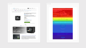
Above the fold
It takes a fraction of a second – 50 milliseconds, which is 0.05 seconds – for a visitor to make a decision to stay on your site or not. This means the part of your page that your customers see first should be an attention-grabber.
Above the fold, set the scene with a strong headline, key points, and include a call to action to encourage the System 1 decision-making mode (‘BUY NOW’, CONTACT US’, ‘READ MORE’ for example).
We know customers enter the funnel at different points in the purchasing cycle. This means, crucially, their needs are different at different points. So there will be nuance in what information you have above the fold.
Heatmaps can show you how many users view content above and below the fold.
Below the fold
If your products are more complex, have a greater monetary value, or there’s a consequence for buying the wrong thing, your customers will rely on information below the fold. Theoretically, we have all the space in the world to explain why this product is the best and why they should buy it now.
However, System 2 is an uncomfortable mode of thinking and we need to bring the user experience as close to System 1 as we can, if not actually flip the mode entirely. Hierarchy is critical below the fold to create a logical purchasing experience in an enjoyable, effortless way. This is where structure and hierarchy meet aesthetic.
How we test structure & hierarchy
Experience helps us to make general assumptions about what will work but assumptions are a testing ground. Data we collect on the behaviours of your audience will tell us quickly enough what elements are encouraging sales.
1. UX testing
We use UX testing to identify – with solid data – what customers want/need and respond to. Changes made based on what “looks good” or “reads well” are subjective and usually wrong.
2. CRO
Making the required changes that have been proven to work. These changes are known as Conversion Rate Optimisation (CRO).
Ready for more?
This is one in a series of articles about UX and consumer psychology – browse the other titles on the main page or head over to discover more about conversion optimisation.
Get started
The way your customers think affects your bottom line. You can avoid wasting time, money and effort on things that don’t work by using UX testing. This will tell you what your customers want/need from your website. Let’s talk it over – book a situational analysis to:
- BENCHMARK where you are
- EVALUATE what is required to achieve your commercial goals
- Outline the PLAN of action to get you on track.