


04.05.2019|
New websites are fun, shiny, gorgeous and replacing your website might seem like the best solution to conversion issues. But starting again from scratch could be unnecessary.
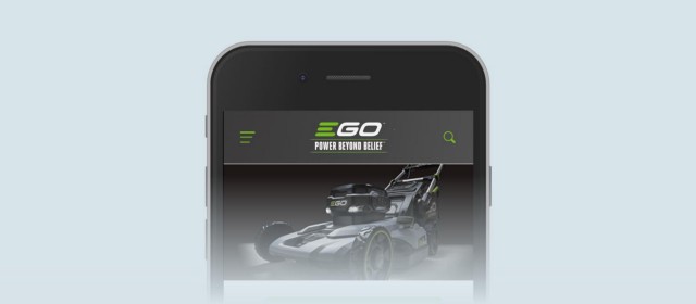
The hamburger menu is synonymous with mobile web design. But why? It’s derided as much as celebrated. And for all its convenience, the move to abandon it is gathering pace.
Ironically, Facebook – the pioneer credited with birthing the hamburger revolution in 2008 – has also led the revolt against it after tests showed exposed navigation encouraged deeper engagement.
And Spotify – an app built around discoverability rather than findability – reportedly experienced a 30% increase in menu engagement when it adopted a tab-based system. Yep.
As another strong critic of the hamburger device, I’m pleased to have the opportunity to share results from my latest research and Conversion Rate Optimisation that suggest Facebook, Spotify and I might be right.
I theorised that the ‘explore’ label could be damaging.
Our first recent hamburger experiment actually retains the hamburger and the hidden menu – but by introducing one small tweak we were able to boost its usability considerably. I think this is an awesome example of a relatively ‘quick win’ you can implement almost immediately. My Door4 colleagues and I were tasked with improving mobile navigation on the website for a scheme set up under government direction.
What we knew:
On desktop, the site employed a pretty standard navigation bar. Yet on mobile this disappeared, and was replaced by a hamburger menu and an ‘Explore’ menu.
I theorised that the ‘explore’ label could be damaging. This is a word usually related to what I term ‘discoverable’ content – things you’re not explicitly looking for, but the publisher hopes you might find want to click on if you stumble across it. Our menu, on the other hand, contained exclusively ‘findable’ content- things our users are looking for to solve a particular problem they face. I also recalled some research findings I’d read recently, which suggested almost half (47.6%) of people aged between 45 and 65 didn’t know what the hamburger icon signified. We hypothesised that changing the word ‘explore’ to ‘menu’ might yield better results.
Changing ‘Explore’ to ‘Menu’ boosted menu engagement.
Sure enough, our menu engagement rate increased by a massive 57%.
Considering the tiny scale of the change – simply changing just one single word – this is pretty remarkable.
Sometimes it’s better to be boring.
‘Explore’ might have been a ‘sexier’ label, but didn’t connect closely enough with user expectations. Sometimes it’s better to be boring.
(As a bonus, we also restructured the menu items within the menu to be more consistent with the desktop menu, which gave us a further 19% increase).
I was chuffed with our result here – and so was the client.
But although we provided a big boost to its usability, we still retained the hamburger device. So what if we could…
Our second variant was bolder…
Soon after, we were presented with another mobile menu to optimise. This time, we went further and removed the hamburger completely. Unlike the previous project, this site has only three top-level navigation items – so it made no sense to tuck them away.
What we knew:
More menu experimentation.
Here, we tested two variants against the control. In our first, we took inspiration from our previous test and added the word ‘Menu’ alongside the hamburger icon. Our second variant was bolder – exposing the top-level menu items directly in the header. There were still some secondary menu links we needed to include, but weren’t important enough to expose by default so w- e did keep a side menu, under the ‘more’ label.
Our first variant presented a good improvement – 13% more clicks, and 13% more sessions containing clicks.

An exposed menu.
However, our second variant – with the exposed menu items – blew it (and our expectations) out of the water. This gave us a 106% increase in clicks, and 120% increase in sessions containing clicks.
This was incredible. What’s more, we were surprised to also see a phenomenal 20% increase in conversions. This wasn’t a primary metric of this experiment, so to see it leap so much was fantastic. Seemingly, this was a result of making it easier to get to the ‘buy’ page, and between different product pages.
Adding a hamburger menu was convenient, but removing it ultimately led to better business performance.
For both examples above, utilising data and risk-free testing:
Both of these user tests have validated my belief that where possible we need to reduce the barriers to mobile navigation.
Whether that’s by making the hamburger toggle action more explicit, or removing it completely – the gains can be considerable.
We’ve taken the learnings from these tests forward and are avoiding hamburger menus where possible. One recent example is a relatively complex e-commerce site, for which we’ve designed a site structure tailored around mobile optimised navigation – allowing us to expose the menu items by default.
This article first appeared on Medium.


Our latest articles, features and ramblings.
We explore performance marketing, AI, communications and optimisation.