
01.05.2019|
As a strong critic of the hamburger device, I’m pleased to have the opportunity to share results from my latest research that suggest we should abandon it.
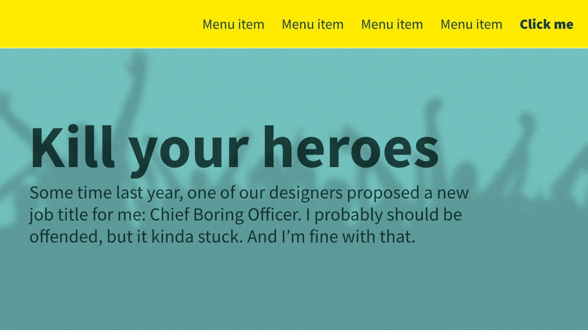
Some time last year, one of our designers proposed a new job title for me: Chief Boring Officer. I probably should be offended, but it kinda stuck. And I’m fine with that.
My new alter-ego was born during a discussion about a website’s aesthetic. It wasn’t the first time I’d had a conversation about performance versus good looks.
The balance between usability of a website and its personality can be a sticking point. Go too far one way and you can end up with a site that screams brand but confuses users. Too far the other and it’ll be super-easy to use – but lack the spark required for users to want to use it.
In both cases, it’s going to fail your objectives.
My favourite website in the world is gov.uk – and it embraces being boring. With its limited colour-scheme, flat black bars, and flat text on a chromeless white background, it’s never going to get pulses racing. And that’s the point. This is a site which understands that its users don’t want to be engaged or inspired, they want information. And quick.
At the other end of the spectrum, there’s Amazon. Here, users do want to feel some level of emotional investment – but it’s one of the ugliest sites on the web. Product pages are stuffed to the brim with what can only be described as ‘stuff’, pushed up against each other, breaking up the content, using outdated design details, with other promotions all over the place with little discernible logic. And yet it’s far and away the world’s biggest retailer.
Why? Because it values iteration, testing, and usability over a sexy visual refresh. Nobody would ever sit at a desk and design a website in 2020 that looks like Amazon’s – but they’ve aggressively tested over the years to introduce tweaks and new features aimed entirely at drawing out more from your wallet. It’s not pretty, but it works.
What’s interesting is that both sites put function over form – yet the end result of that could hardly be further apart. One is about as minimalist as they come, the other is crammed and cluttered.
That’s key, because there are no universal rules to which design patterns work and which don’t. Context is critical. Always.
As Audience Performance Manager (my actual title) at Door4, my job is to understand how people use our clients’ websites. I use this understanding to continually grow performance and smash goals.
And sometimes that means making them a bit more boring, much to the disappointment of designers everywhere.
You might remember a case study I shared previously where we tested changing the label for a mobile navigation from “Explore” to the most standard “Menu” and saw a 57% uplift in engagement.
Fifty. Seven. Percent. Over a single word.
We concluded that, while the original was definitely more interesting, users responded better to a label they were more familiar with. Sometimes it’s better to be boring, I wrote back then. And it holds true.
It’s a direction our UX testing continues to push us in.
Both were less ‘sexy’ and sacrificed the ‘wow’ factor – but they worked. And when it comes to having a pretty website or having a website that achieves its goals, which would you rather have?
I want to share an interesting example of how it pays to be boring. This is an example of ‘kill your darlings’ – or in this case, kill your heroes.
We recently launched a new website for a key client. The visual brief was all about colour, personality and images – using the branding to its full to stand out from the competition. Together with the client, we drew out wireframes, concepts and launched a site we’re all really proud of.
And it works. Performance has been consistently strong. But we’re always pushing it further.
One of the questions we asked ourselves was ‘what impact does the hero image have?’ Most of our content pages open with a huge image at the top, overlaid with the page title and a standfirst. That’s great for building brand and empathy, but it does push the main body content down the page and often out of the viewport completely.
In that personality/usability balance it’s probably further towards the former. For a site tackling a sensitive subject, that might be the best approach. But we wanted to know what would happen if we moved the dial over a little.
We tested four variants against the control:
The latter was a bit of a wildcard, really – I thought it was a bit too boring (even for me). In fact, the whole team’s expectation was that one of the smaller hero images would give us the best performance, with a nice compromise between increased usability while retaining the empathy factor.
We tested all five versions for a month, measuring conversion rate and site engagement. And while all our variants improved over the control, our wildcard blew the others away – with a huge 40% increase in conversion rate and comfortably better engagement.
What’s also interesting is that we observed a perfect correlation between how much of the image we removed, and how high the improvement was. Essentially, the more boring we made it, the better it performed.
In retrospect, it makes sense – at this point in their journey, users don’t care about fluffy images; they’ve come to these pages looking for content. So when we promoted that content, they were more likely to engage with it (and us).
A bonus on top of that was a boost in page speed. By removing the weighty image from the page, we were able to cut key page speed metrics in half.
Interestingly, we’ve taken learnings from this success forward, and are currently testing a few different approaches to reducing the spacing between elements on the page. The same principle applies: put function over form by making it as easy as we can for the user to read the page. It’s early days, but the results so far are super-positive.
The boring successes raise interesting conundrums.
That doesn’t mean stripping out all personality. As much as I love gov.uk, I don’t want the whole web to resemble it.
The site we tested is still packed with fun touches, individuality and quirks. The difference is that these are increasingly accents to the page, rather than core elements.
Instead of a huge hero block pushing the content down, we can add a design detail around the content or behind it. Design that highlights and presents the content, without interrupting it.
Rather than taking away from visual design, it just challenges us to find creative new solutions. So it’s important that individuals from every part of the process – from designers, to marketers, to clients, to management – are bold enough to step forward and say “Let’s try another way”.
It’s difficult to know where to find the right balance – and that’s where a programme of Conversion Rate Optimisation testing comes in. We don’t need to debate every design choice for hours – we can test all the options and see which gives us the best returns.
Where this approach really excels is when you can team creative designers with boring performance professionals. It means that our designers have the freedom to try new ideas, with confidence that my team will challenge them. And it means we can focus on raw ideas to boost our KPIs, knowing that the designers will treat them with care and elegance.
So yes, I’m Door4’s Chief Boring Officer. And I’m proud of that.
If you suspect your website needs similar attention to what I’ve just described, get in touch.
Photo by Esteban Lopez on Unsplash


Our latest articles, features and ramblings.
We explore performance marketing, AI, communications and optimisation.