Your customers want information fast. If the design of your website is confusing, they’ll go somewhere else. Creating instant clarity supports the human preference for instinctive decision-making and makes the sale.
Assume nothing. Test everything.
All elements of your website can be refined to meet the needs of your audience so they can make the conversion. Everything on your site is up for discussion – from imagery to form design, right through to the checkout experience.
You can test everything on the page – hierarchy, components, text, space, imagery and directional cues – separately and in combinations. The ultimate goal is to make customers complete a conversion, so we have to create the right conditions for them to do this. The most effective way to find out what they need is to collect data through UX testing and use it to make the changes to your website that show an upswing in conversions.
TEST → MEASURE → ANALYSE → CHANGE → TEST
One of the most famous examples demonstrating the relationship between UX testing and increased profit was undertaken by Google. The search engine ran a UX test on 41 different blues to discover which shade of link text would make them more money. The winner increased profit by $200m.
“In the world of the HIPPO, you ask the chief designer or the marketing director to pick a blue and that’s the solution. In the world of data, you can run experiments to find the right answer” – Google UK
System 1 is FAST, instinctive, impulsive and accounts for 98% of our decisions.
System 2 is SLOW, rational, analytical and under stress to make a good decision.
We need to use our aesthetics purposefully and with intent, encouraging System 1 decision-making – even for complex purchases. In short, we need to make the purchasing process comfortable, fun, easy, reassuring and prompt.
Aesthetic elements
1. Hierarchy
We’ve talked about how FAST System 1 thinking is intuitive and perhaps it doesn’t make immediate sense to add that the order of elements on a page needs to be logical – surely this is System 2 thinking!
But don’t forget that System 1 makes heuristic decisions – using mental shortcuts. System 1 relies upon an order it can recognise and easily make sense of.
So, use headlines, sub-headings, bullet summaries, images, examples, testimonials, and long form copy and CTA buttons in a logical order.
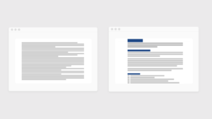
Unformatted vs formatted copy for easier reading and scanning.
While the whole site should, as much as possible, support System 1 thinking, content ‘above the fold’ is particularly important, as this is the area that all users see.
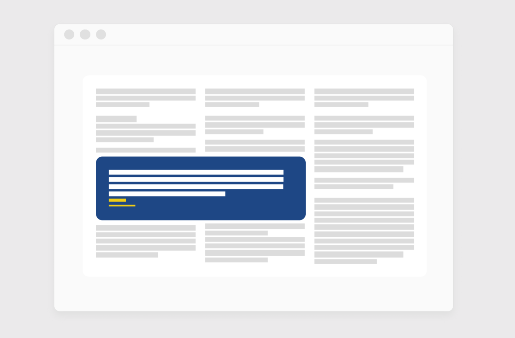
2. Components
Your components assist your page layout. They help you impart the information clearly, legibly and with hierarchical structure. A list of bullet points might be easier to absorb as a grid; two lists might be better as a comparison chart.
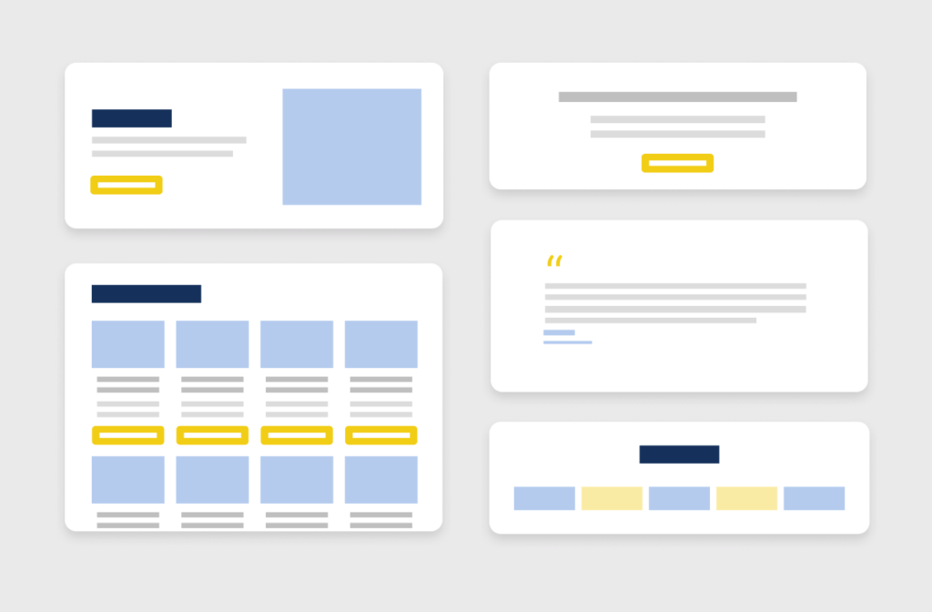
Component block examples for structure and engagement.
Component colour, shape, size and arrangement will also show in an instant what is the most important part of the page. If in doubt, do a squint test – literally, pull up your website, take a step back from your monitor, and narrow your eyes. This visual trick helps you see what components are getting the most priority. In fact, squint at these examples.
3. Text
Font size, line height, and the colour of the text all influence the digesting of important decision-making information. A readable font is also essential – nothing too fancy or too light.
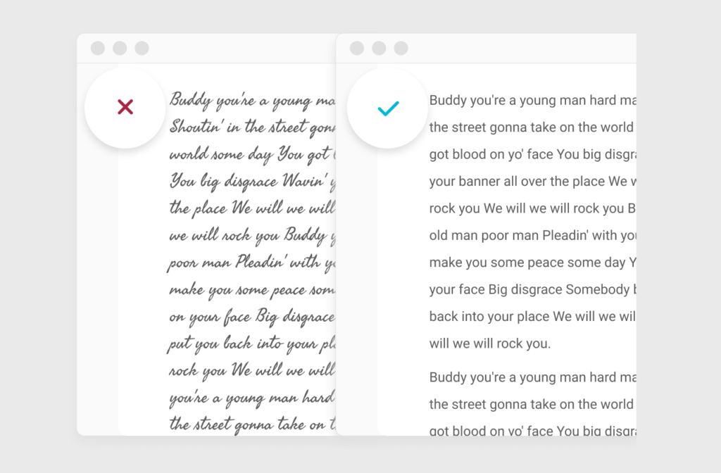
Typographical styles can be hard to read.
Large blocks of text can be cumbersome, so lists, pull quotes and consistently short paragraphs of 3-4 lines help.
Pull quotes can lift out points of interest to grab attention and break up a big body of text.
4. Space
Distractions don’t make for easy decision-making, so leave plenty of space in your layout and even within your elements for the information to be digested as quickly as possible. Basically, the more visual noise, the slower the decision-making process becomes, and the more frustrated the customer. We don’t want to overwhelm the default FAST brain with details that will edge their decision-making towards a SLOW System 2 mode that feels frustrating and effortful.
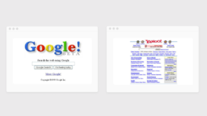
Google vs Yahoo 1999.
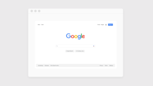
These examples of search engine layout show how Google recognised the benefits of minimalist design way back in 1999. With a philosophy of giving users the information they want as quickly as possible, it’s clearly supportive of System 1 thinking, which has helped it achieve almost complete dominance. In the last two decades, its design, aside from the odd doodle or two, has only become cleaner and simpler.
Present-day Google.
5. Imagery
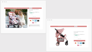
Photographs and other images are powerfully evocative and appeal to emotionally-sensitive System 1 thinking. They can truly convey the power of 1,000 words in a glance.
Lifestyle imagery helps customers imagine what it would feel like owning the product.
Do your models look happy or dissatisfied?
Are they in the right age range for your customer?
Are they wearing clothing and jewellery your customers wear or aspire to wear?
What about the environment they’re in?
Is red in this context a danger signifier or does it mean passion?
6. Directional cues
We like looking at human faces and if a model in a shot is looking or gesturing in a particular direction, we will follow their gaze.
Our eyes will also automatically follow arrows and similar devices. This can be a useful tactic to draw attention to important information or a call to action.
What fascinating element is the model looking at?
How we test aesthetic elements
At the start, we can make general assumptions about what will work, using our experience. However, assumption should only ever be a testing ground! Data we collect on the behaviours of your audience will tell us quickly enough what elements are encouraging sales.
1. UX testing
We use UX testing to identify – with solid data – what customers want/need and respond to. Qualitative research, heatmaps, user testing are superior to subjective opinions on what “looks good” or “reads well”.
2. CRO
Making the required changes that have been proven to work – the best variants, which the data shows have improved key metrics like engagement and sales. These changes are known as Conversion Rate Optimisation (CRO).
The way your customers think affects your bottom line. You can avoid wasting time, money and effort on things that don’t work by using UX testing. This will tell you what your customers want/need from your website. Let’s talk it over – book a situational analysis to:
BENCHMARK where you are
EVALUATE what is required to achieve your commercial goals
Each time you make a subjective assumption of what will enhance your conversions, you risk derailing progress and losing money. UX testing is the only way to safeguard capital investment on website development - and it gets better results.
Structure and hierarchy drive the buyer journey from awareness to conversion. The human brain wants a fast experience, or one that feels fast. If the look and feel of your website is getting in their way, they’ll bounce somewhere else to spend their money.
The human brain is impulsive and favours speedy decisions, but it’s also highly emotional and loves a good story. Identifying the right words means tapping into the driving motivations at each point in their journey.
Scrapbook
We have a lot to talk about.
Door4 opinions and insight - exploring performance marketing, communications and optimisation.
Book a situational analysis
BENCHMARK where you are, EVALUATE what is required to achieve your commercial goals, and outline the PLAN of action to get you on track.